Fix Landing Page Errors That Block New Leads
Learn how lead generation website design fixes quiet landing page mistakes so small businesses capture more calls, emails, and sales without extra ad spend.
A lot of small businesses do the hard part right. You spend money on ads, post on social media, maybe run promos during your busy season. People click, your traffic goes up, but the phone stays quiet and your inbox is empty. Most of the time, the problem is not the traffic; it is the landing page quietly leaking leads.
A landing page is different from a normal homepage. A homepage tries to introduce your whole business. A landing page has one clear job: turn a visitor into a lead for a single offer. For small businesses, startups, and solo owners on tight budgets, that page can make or break your results. If it does not work, every click you pay for is money slipping away.
At Website By Sociowhiz, we see this all the time on local sites. Owners think something is wrong with their ads when the real issue is small landing page mistakes that scare people off. When your lead generation website design is off by just a little, you lose calls, forms, and peak-season bookings without even knowing why.
Confusing Messages That Make Visitors Bounce
When someone lands on your page, they decide in a few seconds if they should stay or leave. If your page tries to talk to everyone at once, most people just leave. This is the "split focus" problem, and it is one of the biggest silent killers of leads.
Common signs of split focus are:
- Listing every service you have on one page
- Talking to homeowners, businesses, and landlords at the same time
- Using headlines that could fit almost any company
- Filling the page with company history before you talk about the offer
Vague phrases like "quality solutions" or "we handle all your needs" do not answer the only question that matters to your visitor: Can you solve my exact problem right now?
Clear, simple, benefit-focused messaging wins. For example:
- Book Your Spring HVAC Tune-Up Today
- Get Same-Day Drain Cleaning in Your Area
- Order Fresh Office Lunch Catering for Tomorrow
Each of these tells a visitor what you do, who it is for, and what they should do next. One page, one main offer. When your lead generation website design starts with that kind of clarity, your ads and social traffic have a real chance to convert.
Weak Calls to Action That Do Not Tell People What to Do
Even when the message is clear, many landing pages whisper instead of speak up. The call to action, or CTA, is what tells your visitor exactly what to do next. If it is weak, hidden, or vague, people stall out and leave.
Here is what we see a lot:
- Tiny Contact links lost in the menu
- Only a phone number at the bottom with no reason to call
- Buttons that say Learn More even when the next step is actually a quote or booking
A strong CTA is clear, specific, and action-based, like:
- Get Your Free Quote in 24 Hours
- Book Your Spring Cleaning Visit Now
- Schedule Your Summer Lawn Care Plan
Good placement matters just as much as good words. On a lead-focused landing page, your main CTA should be:
- Visible near the top, no scrolling needed
- Repeated after key sections, like benefits or pricing
- Matched to the season or reason people are searching
When your landing page acts like a friendly guide and tells visitors exactly what to do, it removes doubt and moves them one step closer to becoming a lead.
Forms and Friction That Scare Away Ready Buyers
Someone who clicks your ad, reads your offer, and starts a form is already interested. Long, pushy forms are like slamming a door in their face. If they feel any extra stress, they close the tab and go to a competitor.
High-friction forms often:
- Ask for too many required fields
- Request budgets or private details right away
- Make people click through multiple pages just to send a simple request
On mobile, this gets even worse. Tiny text boxes, hard-to-tap buttons, or slow, jumpy layouts make it almost impossible to fill things out while someone is on the go. Think about a homeowner standing in a hot house with a broken AC during summer. They will not fight with your form. They will hit back and tap the next result.
Here are simple ways to reduce friction:
- Ask only for what you truly need to follow up
- Make the form look short, even if a few extra optional fields are below
- Use clear labels and larger buttons, especially for phone users
- Show trust signals like a lock icon, SSL, and a short privacy note
Your form should feel quick and safe, like "This will take 30 seconds and someone helpful will reply soon." That feeling is what keeps hot leads from cooling off.
Slow, Untrustworthy Pages That Kill First Impressions
Speed and trust are silent deal-breakers. A slow landing page gives visitors time to second-guess their choice. Broken images or an outdated layout quietly whisper that the business might not be very active or reliable.
People who do not know your brand yet judge you by what they see in the first few seconds. If the page loads slowly, the design looks old, or something seems off, they wonder if they should share their info at all.
Key trust builders on a landing page include:
- Fast-loading on both desktop and mobile
- A clean, modern layout without clutter
- SSL/HTTPS in the browser so visitors feel secure
- Clear contact info so people know you are a real local business
- Consistent branding across your logo, colors, and images
Search engines and paid ad platforms both pay attention to user experience. A fast, secure, modern landing page can support better SEO visibility and better results from paid traffic. Strong lead generation website design is not only about looks, it is also about performance in the background.
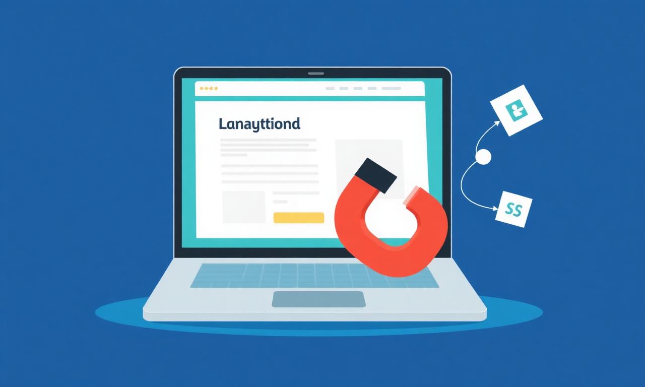
Turn Your Landing Page Into a Lead Magnet This Season
If your ads bring clicks but not calls, it is time to look closely at your landing page. The quiet lead killers are usually simple things: confusing messages, weak CTAs, forms with too much friction, and pages that feel slow or untrustworthy. Fixing these can do more for your business than tweaking ad copy over and over.
A quick self-check can start with just one landing page this week. Ask yourself:
- Is there one clear offer and one main goal?
- Can a visitor know what we do in one glance?
- Is there a bold, specific call to action near the top?
- Is the form short, simple, and friendly on mobile?
- Does the page load fast and feel modern and safe?
As seasons change and your busy times come around, a sharp, focused landing page can turn more of your ad spend into real calls, bookings, and quote requests. That is what we focus on at Website By Sociowhiz: fast, SEO-focused, fully managed business sites built to support strong landing pages, so small business owners can focus on running their business while the website quietly brings in more leads all year.
Explore how our lead generation website design approach has worked for businesses like yours. Check out our Our Work portfolio to see examples of professional websites we have built for small businesses, from lawn care to insurance to local services.
Get Started With Your Project Today
If you are ready to turn your website into a reliable source of qualified leads, we are here to help you map out a clear plan and execute it with precision. At Website By Sociowhiz, we collaborate closely with you to align design, messaging, and strategy so every visit has a higher chance of becoming a valuable lead. Reach out today so we can discuss your goals and start building a site that actively supports your sales process.
Ready to skip the DIY struggle?
Get a professionally designed, fully managed website starting at just C$99.99/year, delivered in 7 days.